Analog Lessons in Art & Information: How Organizational Data Can Begin With a Sketch
By Beth Pidcock, Creative Strategist & Hallie Dunklin, Creative Strategist, Gongos, Inc.
{Authors’ note: This post was inspired by the renowned book: Dear Data}
We all find ourselves living in a world bursting with data. Whether big or small, it’s being generated as we work and analyzed while we sleep. And, as individuals contributing to this data, we can be compelled by our habits and the trends that surface when exploring our own data in aggregate. As creative strategists tasked with illuminating information in ways that compel organizations to act, understanding the visual foundation behind such trends helps us comprehend and transform data into something that is not only functional, but artfully familiar and factual.
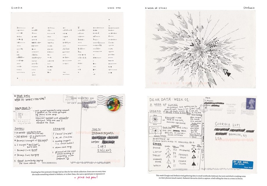
Information designers and co-authors Giorgia Lupi and Stefani Posavec were inspired to work with “small data” (data they generated on a daily basis). In their internationally acclaimed book, they set out to see what would take place if they removed technology from the design process in creating personal data diaries. Hand-drawn postcards sent weekly across the Atlantic became their canvas of choice.
Our Own Analog Experiment
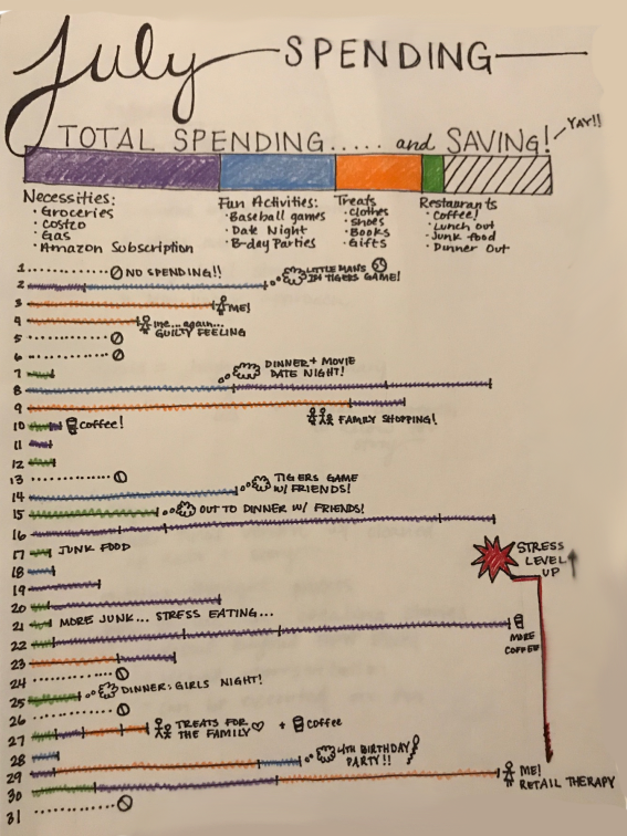
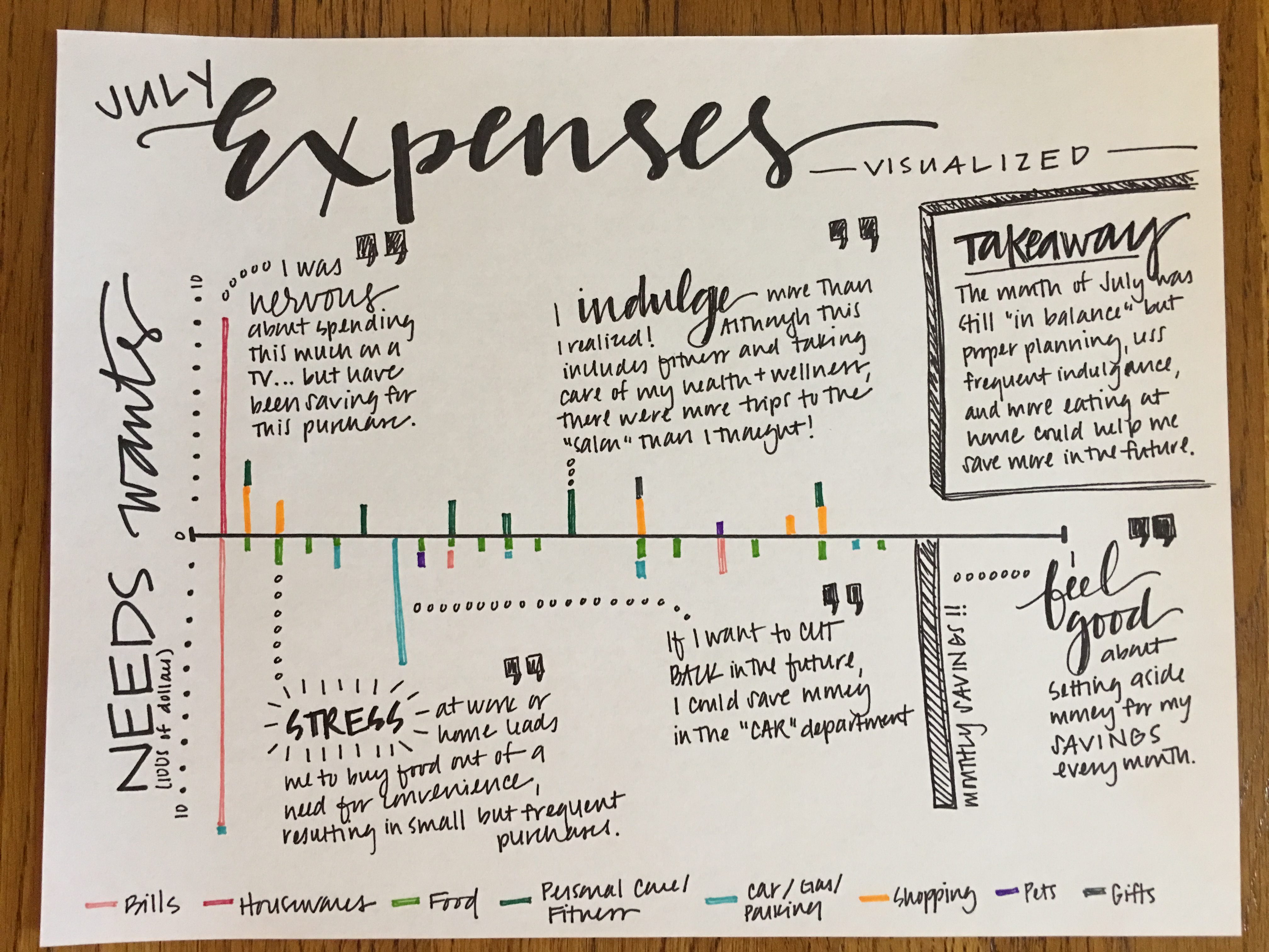
Inspired by their year-long exercise, we too set out to examine the process of converting “data to drawing” by accessing something very tangible and highly personal—our own spending. For one month, we challenged ourselves to document our daily purchases, pinpoint patterns, and identify themes to better understand the rhythms within. This kind of “free-forming” often remains hidden in a visual communicator’s sketchpad. And with exception of a seasoned illustrator in a focus group setting, these early strokes of doodling are rarely seen by corporate stakeholders.
Yet, in an industry that’s never short on numbers, the design perspective can be overlooked. It’s often seen as an exercise in which one takes fully formulated content and applies structure, color, and typefaces to achieve a desired look and feel. However, analog experiments such as these demonstrate that the creative process is anything but packaging data. It is a front-loaded, explorative journey that transforms raw numbers into something that no longer resembles data, but rather, visual depictions to be shared, stories to be told, and insights by which to act on.
Initial Sketches: Structure
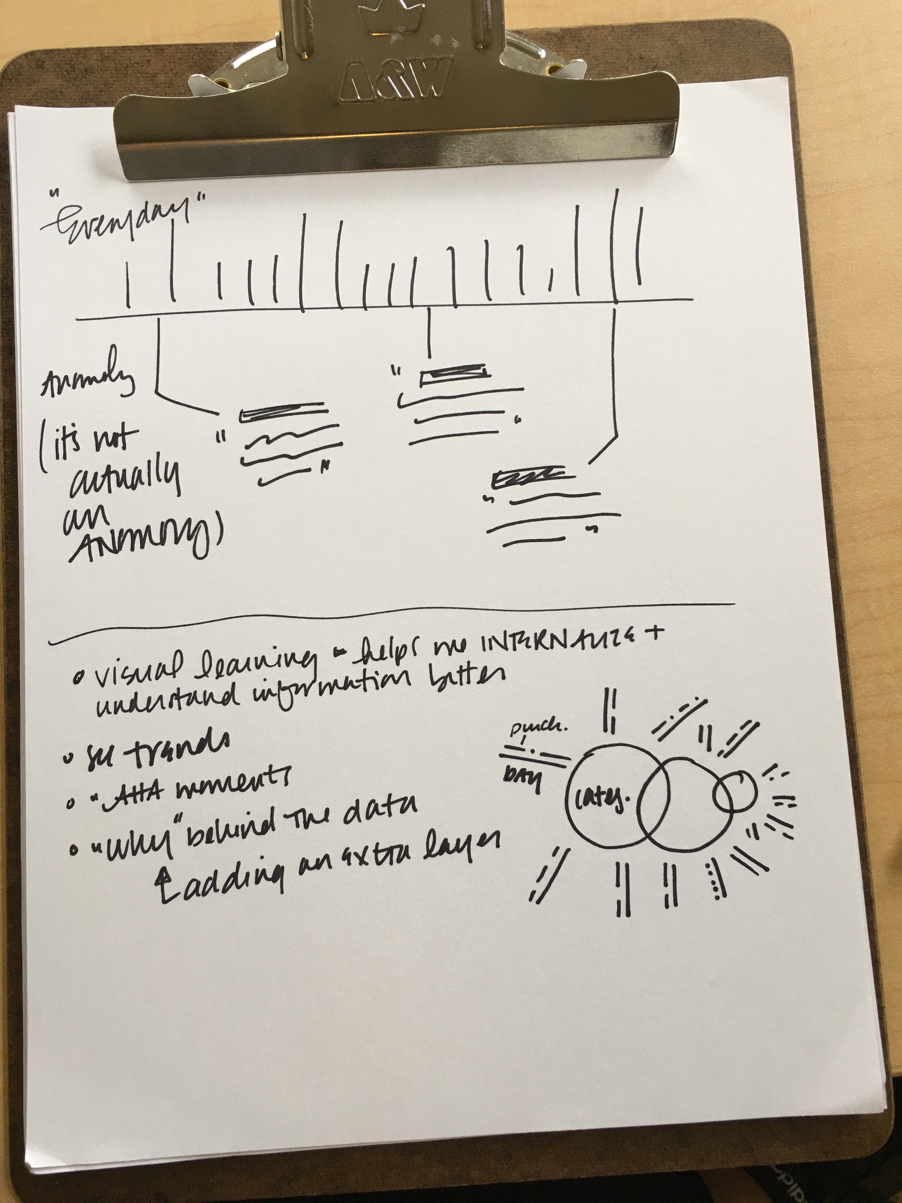
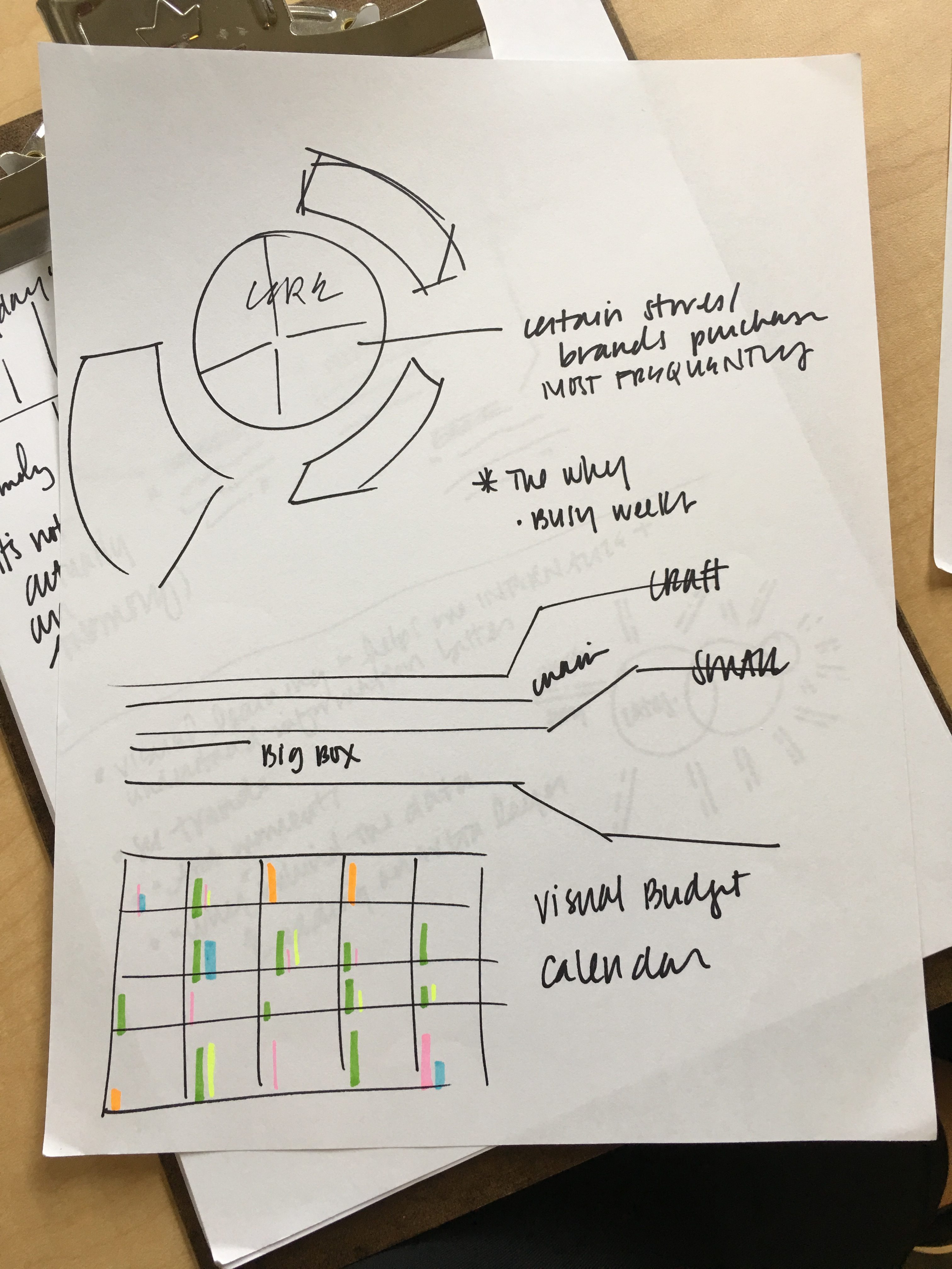
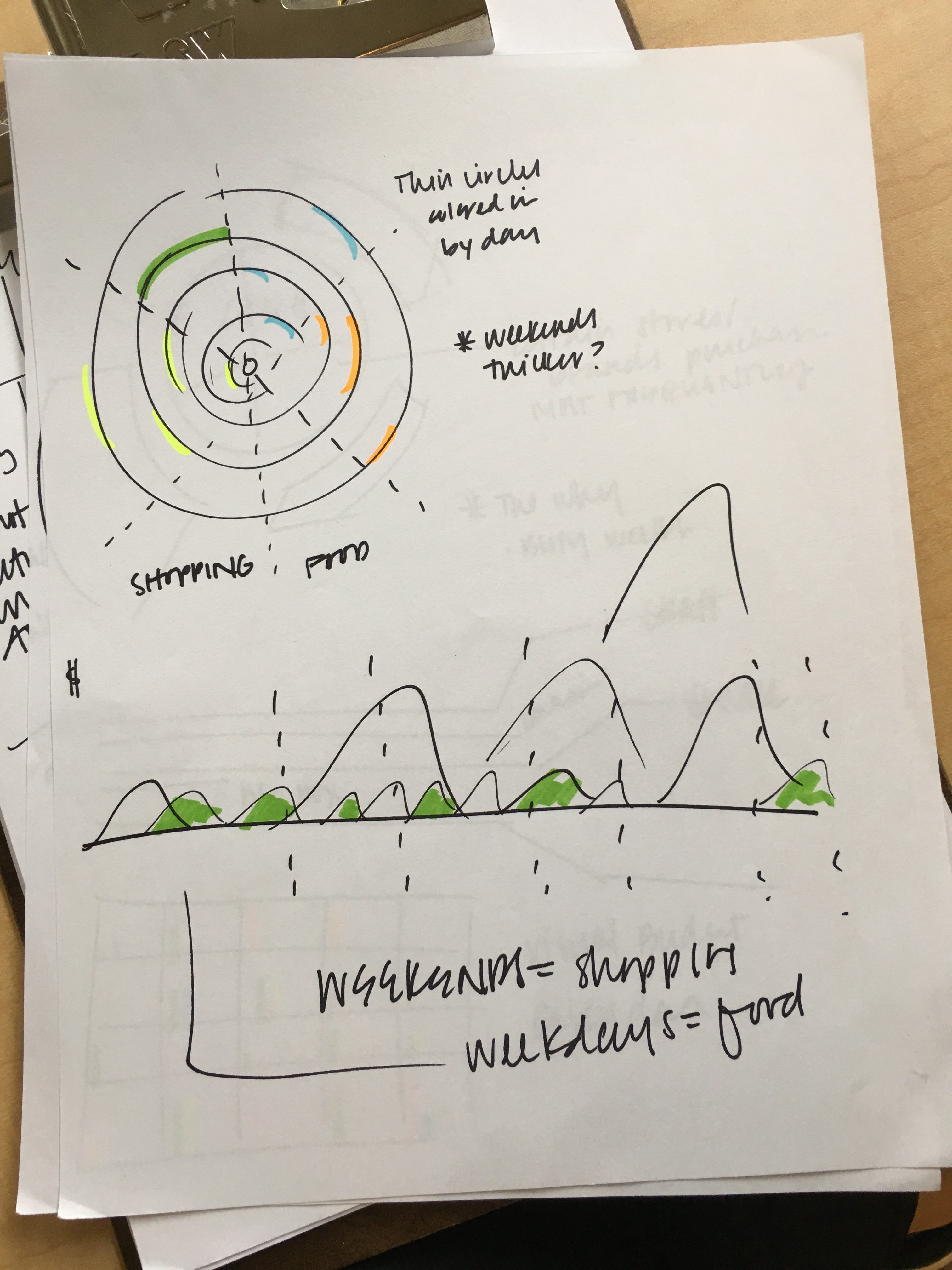
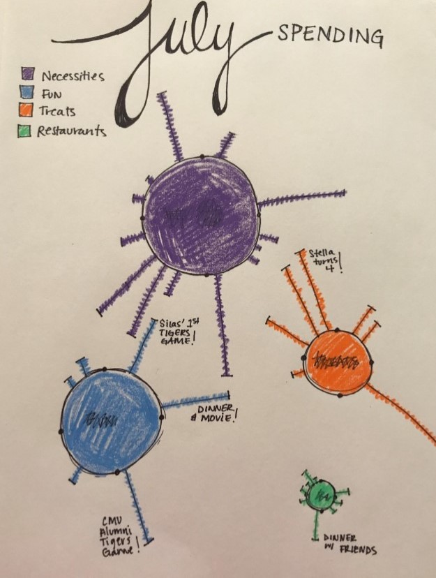
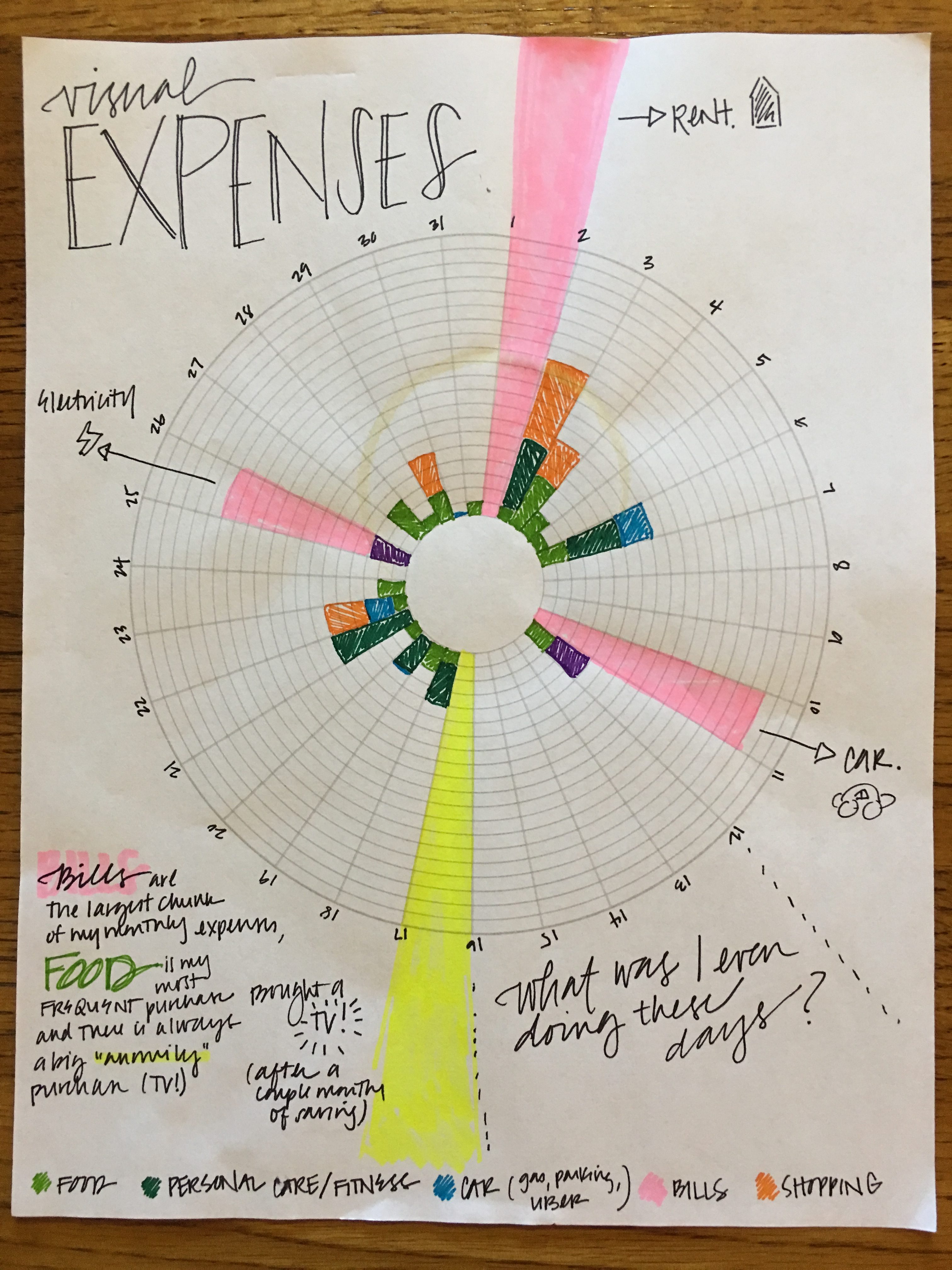
Our initial sketches were very elementary, meant to explore how the information could potentially take shape. With little time spent on any one idea, we quickly weeded out those that either would not scale or would possibly result in a misleading representation of the data. For example, a circular construct may be more aesthetically interesting, but as the dollars scaled outward from the center to the edge, they appeared to grow exponentially with the size of the circle, which does not accurately reflect the spending pattern.
Draft Sketches: Applying Information
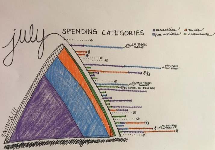
Once acknowledging that our initial sketches depicted our spending in a somewhat disparate fashion, we chose the constructs that better lent themselves to capturing the whole story.
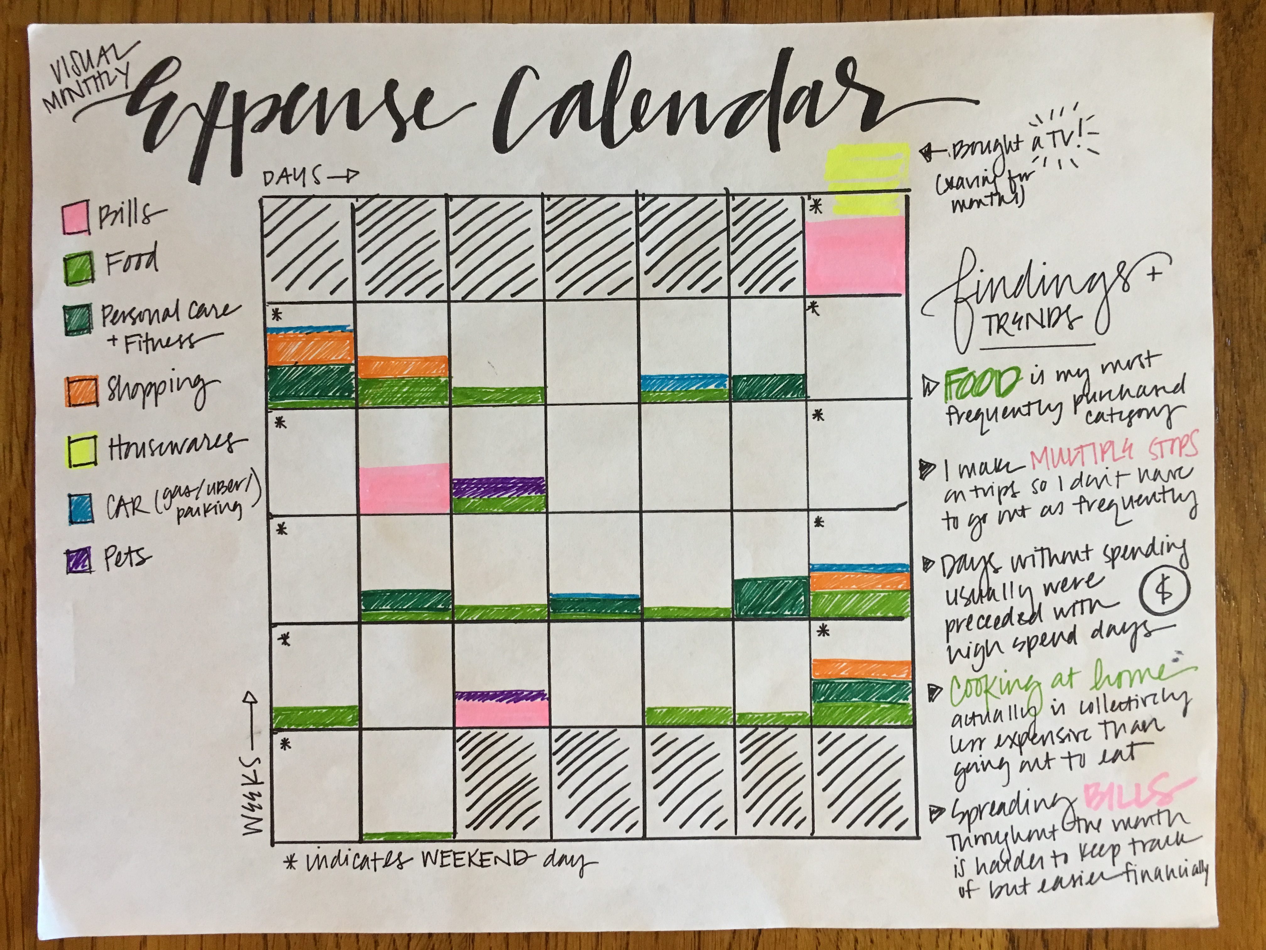
We capitalized on the strengths of certain constructs while leaving behind their weaknesses. One or two sketches captured the emotions associated with spending. Others used artistry to depict categories of spending and saving, yet were harder to interpret or reveal patterns. In yet another, we recognized that a familiar construct to depict weekend spending vs. weekday spending would be a calendar, but only if that is a key insight in our findings—and it was not.
Final Sketches: Capturing the Story
We agreed on the idea that the “hard” behavioral data (i.e. what we actually spent) became more telling when we could add the “soft” data behind it (i.e. why we spent and how we felt when we did). Layering in both types of data allowed us to humanize a story grounded in insights.
The final drawings convey how memories are often made through atypical spending and one-off purchases; that stress has a definite impact on spending; categorical purchases have varying degrees of importance in our life; and that unspent dollars aren’t as difficult to achieve as we would have thought.
Beyond that, they also depict where we spent the most, the frequency of certain purchases, and where we could scale back in the future to increase our savings. Although we explored other options and considered some to have more of a “cool factor,” we ultimately agreed that a linear approach was a truer representation of the narrative.
A Visual-Thinking Approach: Frontloading the Process
While there is certainly a place for packaging content in the business world, in a decision intelligence company, our charge is to “see” the information when no one has visually made sense of it yet. We must reach into our right brains to find the themes that jump off the spreadsheet and can be depicted into a mosaic of knowledge.
While the data sets are typically much larger and objectives more defined in our client work, the concept of visual foresight and creative exploration stands true. In working with corporate teams, we have found that frontloading the visual process offers practical, and even measurable, benefits:
- Rough drawings are fertile ground for group ideation and iteration.
- Sketching enables ideas to be conceived and abandoned quickly.
- Basic constructs are leveraged to gain alignment before building them out.
- Drawings allow for open exploration before engaging with expensive and potentially constraining software.
- Early sketches can help inform final visual medium, e.g. playbook, wall graphic, interactive portal.
In an industry that’s overloaded with inputs, it is the visual perspective that can breathe new life into data and insights, transforming them into artifacts to be preserved.
The ultimate goal of an information designer is to create a compelling story that remains true to the numbers and matches the audience’s language of learning. A truly successful piece strikes a balance between beauty, accuracy of information, and its ability to incite action—all the while instilling a better understanding of the humans behind the data.

